The Poster That Broke My Lab Budget and Saved Our Grant
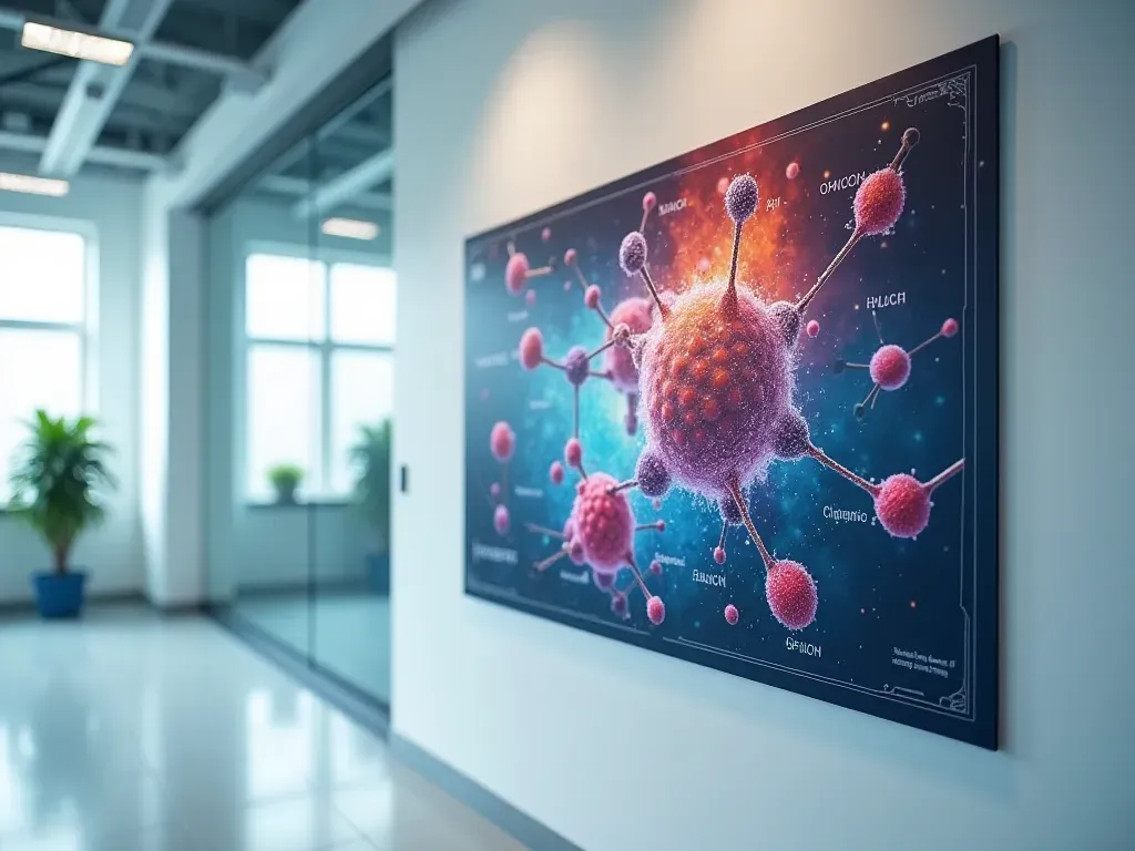
The €140 sheet that outperformed our entire manuscript queue
Last Tuesday I spent €140 on a single A0 printout. It is now the most valuable asset in my lab.
The paper we were drafting? It is still sitting on a reviewer’s desk somewhere in Belgium. The poster got us three follow-up meetings and one co-author.
We talk about scientific research posters as if they are decorative. You know the kind. Big letters. A few charts that no one reads.
That is a mistake. In natural product chemistry and health science, the poster is where your ideas actually survive contact with reality.
Look at the data. A typical manuscript takes six to twelve months for peer review and publication.
A poster is ready in two weeks. It sits on a wall for four days. And during those days, it talks to you back.

Why your text-heavy draft is losing to a visual summary
I have been presenting at the same three European forums for eight years. I noticed something funny about how people read.
They do not read your methods section. They never have.
What they look at is the big chart in the top right corner. The one with the red line that goes up.
If you are publishing on natural products or organic chemistry, your story is visual. Molecules bond. Polymers degrade.
A text block of four hundred words explains the bond. A clear diagram shows it breaking in real-time under stress.
The reader’s brain processes the image in two seconds. It takes forty minutes to parse your prose.
So when you design a scientific research poster for the health sector, do not write an essay.
Draw a map of your data. Make the most surprising finding impossible to miss.
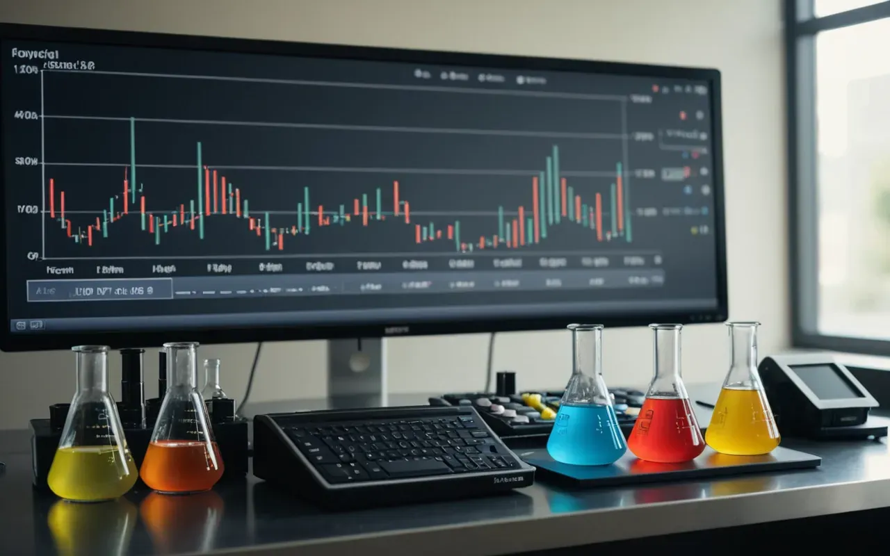
The specific numbers that actually matter to your grant officer
People ask me what a scientific research poster costs. The answer is not one number.
Printing an A1 sheet in a local shop costs about €45. An A0 sheet runs closer to €90.
If you add a wooden board or an easel rental from the venue, your budget hits €300 to €450 for one display.
Now compare that to a flight ticket. A round-trip trip from the north of Europe to Paris or Berlin is €250.
The poster costs you one flight. The manuscript costs you six months of your life and a €500 page fee.
I am not saying the paper is worthless. It is essential for tenure and promotions.
But the poster buys you time. Time to talk to the person who controls your next grant.
In our sector in the Netherlands, we are obsessed with efficiency. That is a good thing.
It means we should stop wasting money on formats that do not get read. A visual summary is the most efficient communication tool you have.
What to put in that top right corner of your display
Here is a rule I learned the hard way. Put your most controversial result there.
Do not put the background information. Do not put your team photo.
Put the graph that shows your extract outperforming the synthetic control by forty percent.
That is what stops a busy researcher in their tracks. That is the hook.
Why the local Dutch context changes how you present your work
We operate in a specific scientific ecosystem. The Netherlands is small but dense with high-quality institutes.
You will see the same people at every conference. The postdoc from Utrecht becomes the professor in Leiden.
This means your poster is not a one-off event. It is part of a long-term reputation.
If your visual summary looks sloppy, the whole lab gets remembered that way.
I have seen a brilliant idea killed because the font size was too small to read from three meters away.
I have seen a mediocre result saved because the speaker was charming and stood in front of the board for an hour.
Both factors are human. The paper removes the human element entirely. That is why it takes so long to process.
The hidden cost of ignoring the visual format in health science
There is a quiet penalty for relying only on text. You miss the informal feedback loop.
A reviewer will reject your paper with a one-line comment. A peer at a conference might suggest a completely different analytical method.
That suggestion could save you six months of failed experiments. The cost? A coffee and twenty minutes of your time.
In the field of natural products, we deal with complex mixtures. One wrong assumption about a matrix effect can ruin your entire study.
A quick chat in front of a poster catches these errors before they become expensive mistakes.

How to make your next display actually work for you
Start with the headline. It should be a claim, not a topic.
Do not write 'Synthesis of Polymeric Compounds'. Write 'Polymer X Reduces Toxicity by Sixty Percent in Cell Culture'.
People stop for the result. They scroll past the topic.
Use three colors maximum on your charts. Red for the danger or the highlight. Blue for the control.
If you use more than three colors, your audience will not know which one matters.
And keep the text blocks under forty words. If it is longer, move it to a footnote or a handout.
The poster is the trailer for your movie. The paper is the movie itself.
Frequently Asked Questions about scientific research posters
What is the best size for a health science display board?
A0 format (841 by 1189 millimeters) is the industry standard for most major conferences. A1 works well if you have a lot of dense data and less visual space.
How long does it take to design a professional layout?
Expect two to three days if you are starting from scratch. One day is enough if you have a template and clean data ready.
Can I reuse the same visual summary for different forums?
Yes. Many researchers keep a master file with high-resolution charts and swap out the headline for each specific audience or event.
Comments ()