The Scientific Research Poster Is a Broken Communication Tool
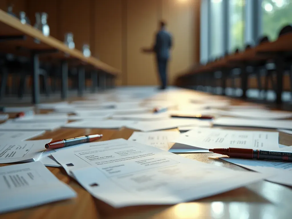
The Silent Failure of Visual Science Communication
I once watched a brilliant polymer scientist stand in front of her board for forty-five minutes. She had spent three weeks on it. The audience walked away confused. That right there is the quiet tragedy of modern academic communication.
The scientific research poster has become a broken tool. It was designed to be an oral presentation with visual support. Instead, it turned into a wall of text that nobody reads. We need to fix this.
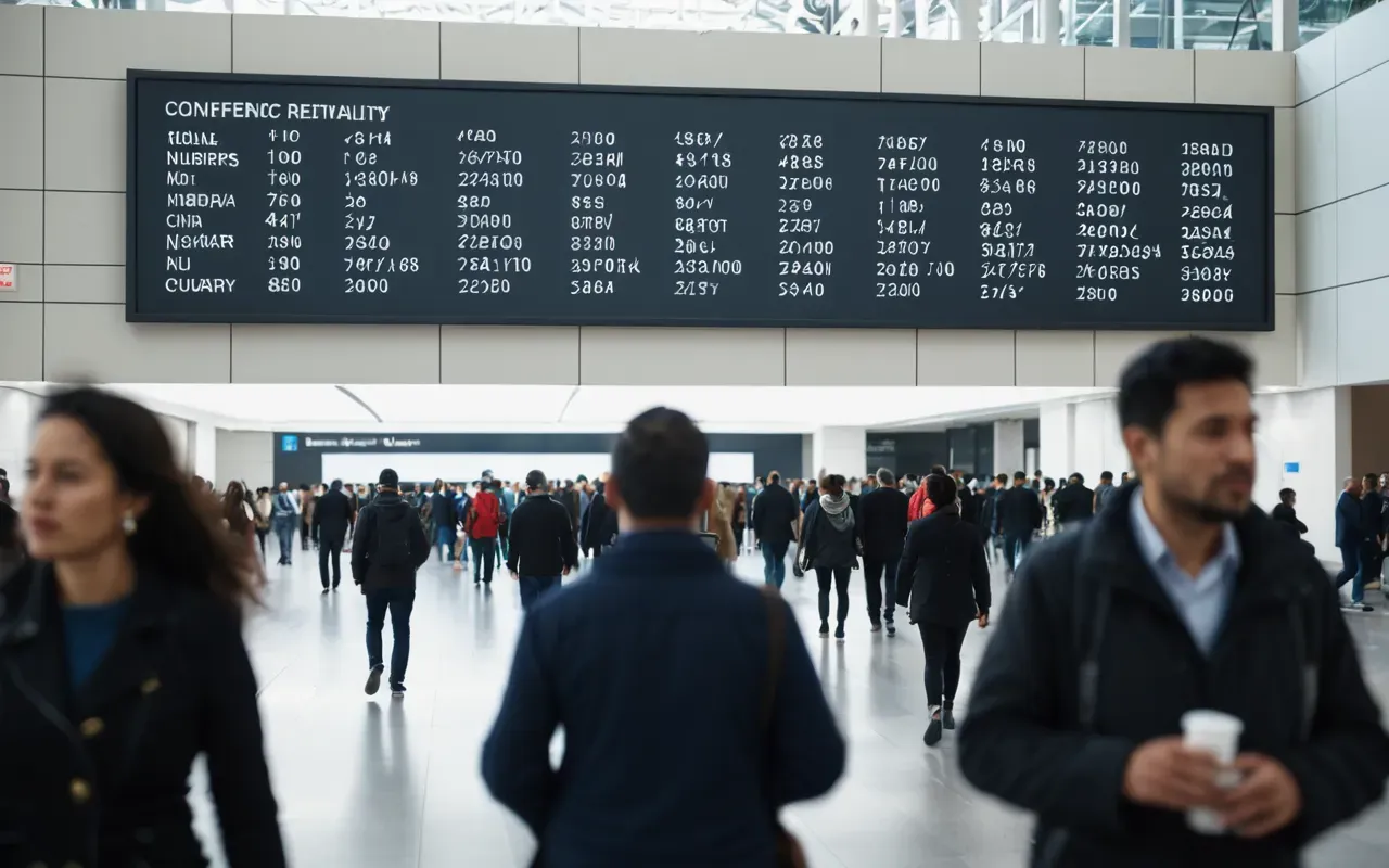
Think about where these boards actually live. Conference halls are loud. People move quickly. Attention spans are short. A board that needs a quiet room and a laser pointer fails its primary purpose immediately.
Why the Standard Layout Fails Every Time
The classic scientific research poster uses a grid of six to eight blocks. Introduction, Methods, Results, Conclusion. Looks organized on the computer screen. In reality? It fails.
Here is why. Human eyes do not read walls of text at arm's length. They scan for visual anchors first. When a board is full of dense paragraphs, the eye bounces away to find something easier.
I have seen this repeatedly in health science labs. The most impressive data gets buried under a wall of methodology notes. The audience misses the breakthrough because they are trying to find where the Methods section ends.
The Cognitive Load Problem
Cognitive load is the amount of working memory a person uses. Read text while standing and listening to someone else talk, and your brain gets overloaded fast.
A good board respects this limit. One clear idea per section. If you need to read a paragraph to understand a graph, the design is wrong.
Look at how the silent bottleneck in organic chemistry labs often hides behind complex data presentation. The issue is rarely the science itself, but how it is shown to others.

The Three Rules That Actually Work in Practice
After reviewing dozens of boards from major European conferences, I found three patterns that consistently attract attention. These are not aesthetic opinions. They are functional rules.
Rule One: The Three-Second Test
Can a stranger understand your main point in three seconds? If not, fail. The title and the largest visual element must tell the story instantly.
Say your board is about natural polymers. Show the polymer structure large and clear. The title should say what it does for health. No jargon in the headline.
I remember a board that just showed one beautiful molecule and a single sentence about drug delivery. It drew more people than the ten-page essay next to it.
Rule Two: Visual Hierarchy Is Non-Negotiable
Size and color guide the eye. The most important data must be the biggest thing on the board. If your methodology is larger than your results, you are telling the audience they matter more.
Use contrast. White space is your friend. A board that looks full often feels empty to the brain because it lacks focus.
This applies even when presenting complex natural product research. The visual structure must simplify the complexity, not add to it.
Rule Three: Write for Scanners, Not Readers
Most people do not read posters. They scan them. Your text should be bullet points or short phrases that support the visuals.
If you find yourself writing a sentence with more than fifteen words on the board, cut it. Move that detail to your oral presentation or a handout.
The board is a billboard. The speaker is the book. Do not make people read the cover to understand the plot.
Common Mistakes That Kill Your Impact Instantly
I see the same three mistakes in every hall I enter. They are easy to fix but rarely fixed because they feel correct on a screen.
The Wall of Text Trap
This is the biggest offender. Blocks of text that look like a journal article page. The eye rejects it instantly.
People assume that more text equals more credibility. It does not. Clarity builds trust. Density destroys it.
If you are struggling with this, consider how the secret life of a scientific researcher in polymer science often involves translating complex data into simple visuals. It is a skill that can be learned.
Poor Font Choices and Low Contrast
Using decorative fonts for body text is a mistake. It makes reading harder and looks unprofessional.
Low contrast between text and background strains the eyes. Always test your board in a dimly lit room before printing.
Ignoring the Audience's Background
A board for specialists can be dense. A board for generalists must be simple. Know who is standing in front of it.
If your audience includes industry professionals and students, aim for the middle. Explain jargon briefly.
How to Redesign Your Board in Under an Hour
You do not need to start from scratch. Follow these steps to fix a broken board quickly.
Step One: Strip It Down
Remove every piece of text that is not essential. Keep only the headlines and key numbers.
Ask yourself: If I removed this sentence, would the audience miss a critical point? Usually, the answer is no.
Step Two: Rebuild with Visuals
Replace dense paragraphs with diagrams, charts, or icons. A good icon can replace three sentences.
Use consistent colors for related items. This creates a visual flow that guides the eye naturally.
For example, if you are discussing the chemical trick that makes your plant extract a statistical ghost, use a consistent color for the 'truth' elements and another for the 'illusion'. This visual coding helps the audience follow the logic without reading every label.
Step Three: Test from a Distance
Stand three meters away. Can you read the title? Can you see the main graph?
If not, increase font sizes or reduce content. The board must work at a distance first.
The Future of Academic Presentation is Visual First
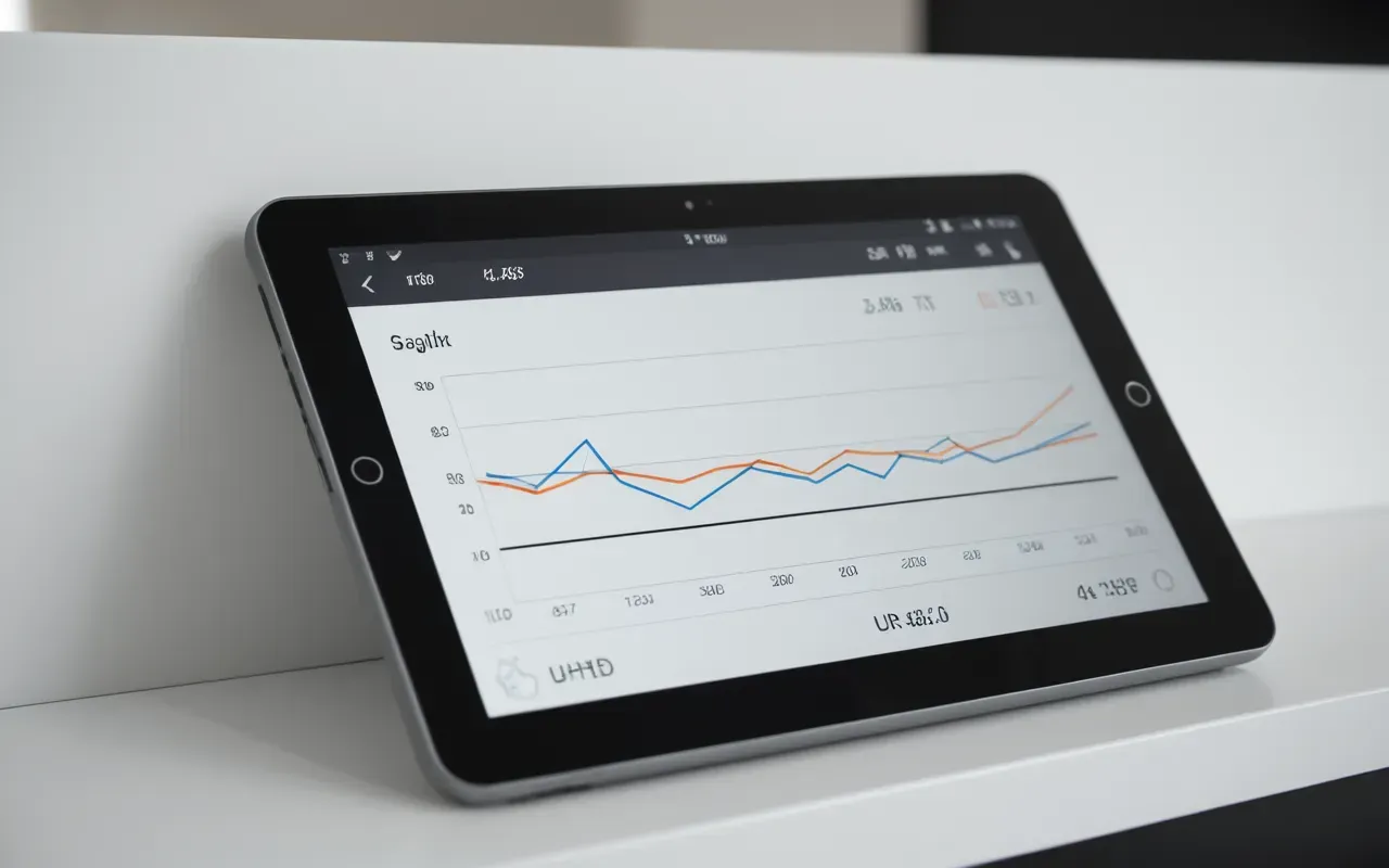
We are moving away from text-heavy boards. The next generation of researchers will treat their posters like infographics.
This shift is already visible in health science. Clinicians and scientists prefer quick visual summaries over long explanations.
If you want to stay ahead, start practicing now. Make your next board simpler, clearer, and more visual.
The best scientific research poster is the one that gets understood. Not the one with the most words.
Frequently Asked Questions
What is the ideal size for a scientific research poster?
The standard size varies by conference but is often A or equivalent. Check the specific requirements of your event. The physical dimensions matter less than readability at a distance.
How much text is too much for an academic board?
If more than thirty percent of the space is filled with paragraphs, it is likely too much. Aim for short phrases and bullet points that support visual elements.
Why do people ignore dense scientific posters?
Cognitive overload causes viewers to skip dense text. They prefer visuals that convey information quickly without requiring deep reading effort.



Comments ()